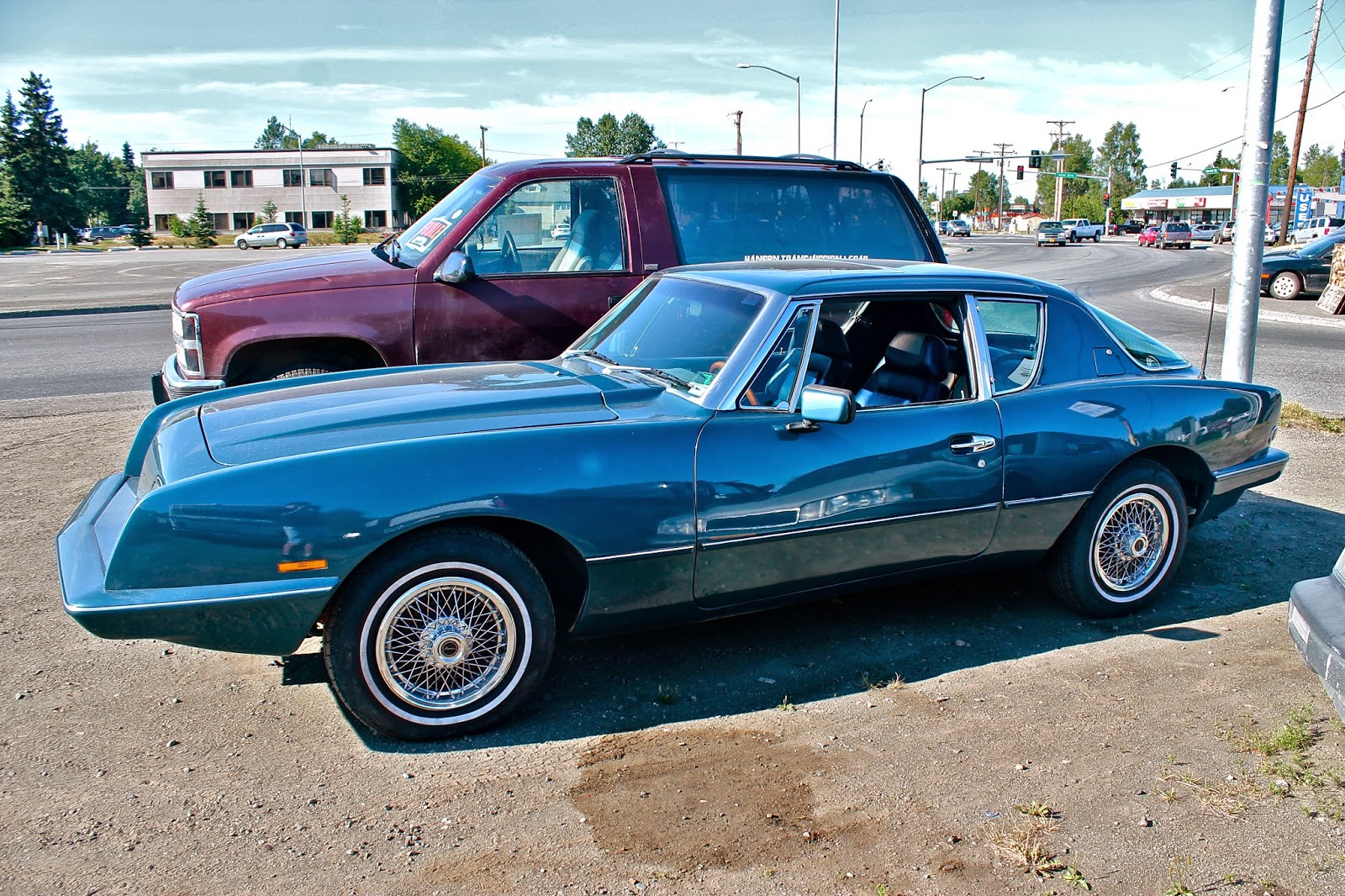
When I first saw this blue Avanti shining in the Alaskan sun, I had absolutely no clue what it was, but its design really struck me, so I snapped a few photos. I then went and did some research on this intriguing vehicle, and found it had a very interesting history. Initially, the Avanti was made by Studebaker, who introduced it in 1962. But the factory in South Bend, Indiana where they were produced was shut down in 1963, ending the Avanti's time as a Studebaker, which closed down for good just a few years later. But three Studebaker dealers, Nate and Arnold Altman and Leo Newman, bought up the Avanti name, tooling, and plant space. Just a few years later, the Altman brothers introduced the Avanti II, a slightly modified version of the original. They produced the Avanti II until 1982, and the model I saw is most likely from this era. After that the car bounced around from owner to owner, until 2006 when the final Avanti rolled off the line.
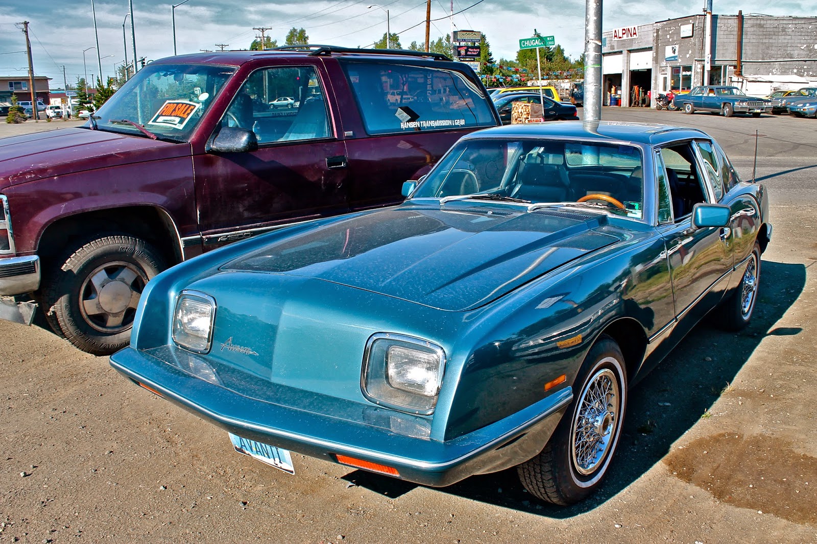
 But enough history, lets get to the design. The front end looks somewhat awkward to me, as it seems to be a strange mix of sharp and smooth lines. The headlights are rectangular, and are set back a few inches, with the base and sides of this portion making sharp, almost ninety degree angles with the forward fins. I think it is a little strange for the fins to stick out that much in front of the headlight section, but it is even stranger when those fins stretch back into very smooth and curvy lines. The Studebaker Avanti, with its circular headlamps, looks more natural with the swooping bodywork. Another thing that looks strange at first is the lack of a grille, but over time I have come to like this uniqueness and it makes the car look sleeker. The hood features a bulge only on the driver's side, and gives off a powerful impression.
The car's cabin is supported by very thin A and B pillars, but a thick upside down V-shaped C pillar. The side windows sweep upwards right in front of the aggressive rear haunches, creating a elegant curved parallelogram out of the three piece window. The continuous silver trim piece running around the car makes the car look like its almost two separate pieces, and this makes the swooping upper half appear to have a strong and stable foundation in the hard edges of the bottom section
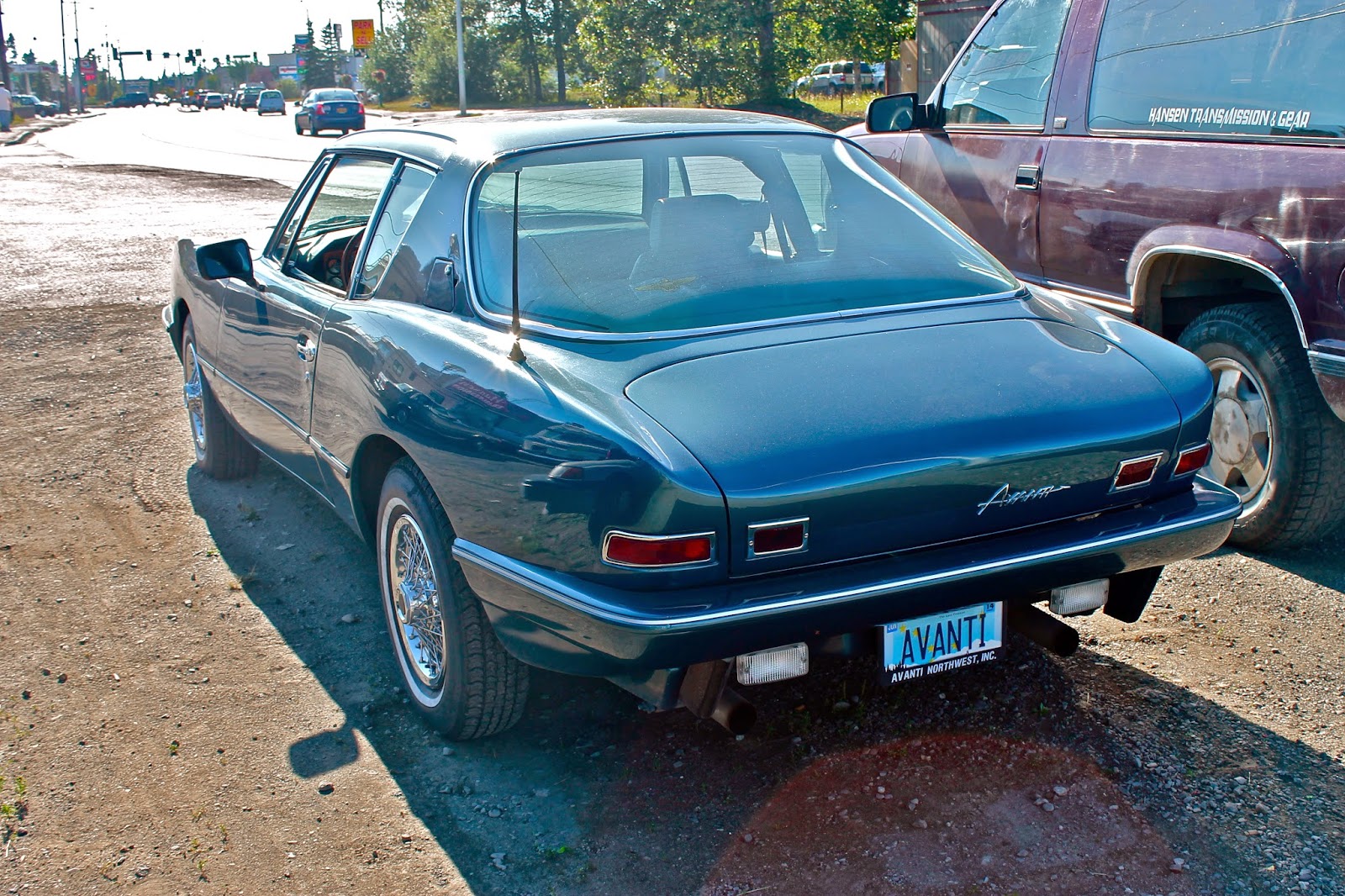
 The cockpit is finished off with an expansive, curved rear window, which runs in to the short rear deck. While the rear fenders and trunk feature very graceful lines, again the problems I had with the contrasting design from the front appears in the taillights. Each taillight consists of two separate rectangular pieces, which are honestly very boring and also don't fit with the fluid lines running down the side of the Avanti. But, while the taillights may be dull, the simplicity of the rear is quite beautiful.
The font used on the front and rear of the vehicle makes the letters look futuristic while also appearing to be very animated and cartoon-like. And the horizontal line that runs through the whole word also makes the word seem to be in motion.
I'm glad I stumbled upon this interesting car, and it was great to learn its history and see such an interesting, though awkward design.
Grade
Front: C+
Rear: B+
Overall: B

No comments:
Post a Comment