Thursday, November 6, 2014

Lexus SC 430


     The Lexus SC 430 is an absolutely stunning sports car. The Lexus Sc 430 is also a design catastrophe. See, the SC brings out extremely mixed emotions in me. This contrast makes it a very strange car to review, because sometimes I just love it, while other times I just can't bare to look at it.
     The SC looks its most sexy when viewed from the curvy rear. The elegantly shaped taillights fit in snugly over the powerful, cat-like rear haunches, and flow well into the rear bumper, creating a very fluid and well put together appearance. The lower rear fascia's simplicity further strengthens the slick, stylish image, but a touch of power is visible in the two massive exhaust pipes. The cabin also integrates smoothly into the trunk lid, especially for a hard-top convertible. The cabin's height and angle with the hood and trunk create the perfect sports car silhouette, not as upright as a normal passenger vehicle, but not as squashed as a supercar. Another nice touch appears on the lower front fascia, which features bold oval lights flanked by chrome inserts, all set back in a sporty intake.
     And that's the last of the good stuff. Despite the allure of the rear end, I still had a couple of quibbles with the back. My first issue was the brake light, which felt very out of place. On most cars, the brake light is mounted inside the cabin, but because this is a convertible, that could be difficult logistically. But having it stick up just behind the rear window disrupts the flow of the car's shape. A better place to put it would have been to integrate it into the spoiler. The other problem I had was with the small circular reflector piece on the side of the bumper, which also felt out of place and unnecessary.

     But those are minor complaints when compared to the bloated headlights and gaudy grille that lead catastrophic  front end. The larger oval headlights don't feel appropriate on a car that is otherwise so sleek, and the absurd dip on the inner edge of the headlamp makes the headlight look swollen. A straight, undisturbed line would've fit in better with the crisp and expressive character lines on the hood. The other main culprit of this ruined front fascia is the grille. There is too much chrome on the grille, making it look cheap and overdone. Also, the vertical slats are set back in the chrome surround, lending a snout-like appearance to the nose of the SC.
     The Lexus SC 430 is an interesting case, with its schizophrenic design, the mostly gorgeous back and largely hideous face. While the smooth and elegant taillights and character lines lend the car a sports car look, the cheap grille and fat headlights give a contrasting unattractive, and uninspired appearance.


Grade
Front: F
Back:A-
Overall: C+

Sunday, October 12, 2014

Ford Falcon Van

      I love vans. The large expansion of the van market in the U.S. has played a part, with the recent additions of the Ford Transit, Ram ProMaster and ProMaster City, and the Chevy City Express. But my fascination also stems from  the flat front vans of the 1960's, such as the Dodge A100. So I was extremely excited to come across a van I'd never heard of, the 1961-1967 Ford Falcon van.
       The van is  based on the Ford Falcon compact car yet it gets its own distinct look. The triangular grilles that house the headlights point inward and are a very quirky and creative way to allow airflow to the engine. The compact font of the word "Ford" cleverly reflects the squat silhouette of the car. (On the side and back the word "Falcon" is written in a stylish script.)
     The flat front, while not uncommon then, sticks out among today's traffic, and adds extra pizzazz. The side features a simple character line just above the door handles, and a funky inverted second window. Around back, the van is fairly basic, with normal barn doors and small circular taillights.
      Despite the van's many simplistic features, such as the taillights and headlight shape, there are enough bizarre and interesting design cues, like the headlight grilles, the badge font, and the second window, to make this van among my favorite designs.

Grade
Front: A
Back: B
Overall: A-


Saturday, August 23, 2014

Nissan Altima 2.5 S

      The Nissan Altima 2.5 S is a boring car to look at.  Sure, it takes you where you want to go-- last year, on my family's vacation to Alaska this popular midsize sedan proved to be a very capable sedan for our 1,500 mile driving trip-- but there was nothing impressive visually on either the inside or the outside.
      It starts with the disappointing front fascia. The headlights have a very smooth and elegant outline, but the actual headlamps themselves appear as a jumbled mess of contrasting straight and curved lines. The grille's shiny chrome surround and three horizontal bars are fine but it feels a little small, creating a slightly cheaper look.  The Altima also looks quite cheap on the lower front fascia. The fog lamp housings have no fog lamps (the housing is there for more upscale Altima models), and instead have a flimsy looking plastic cover. This is a common problem when car companies get into cost-cutting measures--it always shows and it always looks awkward.
    The lower grille and intakes look fairly lackluster because of the plastic body colored cross-bars. One detail that works is the character line from the headlights which dips down and curves underneath the lower grille, creating a U-shape. Also the power bulge and creases on the hood  add an athletic vibe to the sedan. Still, these few small positives can't outweigh the cheap look that pervades the front.
     Around back, the taillights are actually quite nice--they are very detailed and it almost feels as if you're looking at a cross section of the taillight. The only complaint could be that they look a little robotic, and that look could be considered a little juvenile, but I don't mind it. The rest of the rear has nothing remarkable about it, although the dual exhaust pipes add a slightly sporty appearance. The short rear deck makes this car feel a little smaller than a midsize sedan (Actually, when I was little I thought the Altima competed in the compact segment).
      Inside is more of the same: a boring and slightly lackluster design that isn't particularly appalling or enthralling. Our car had a grey and black interior, and these drab colors might have contributed to how unexciting the interior appeared. I like the three circular air conditioner vents at the top of the center stack, but the rest seems over-cluttered by buttons, and I found the orange color of the radio screen especially gross. While not very pretty, the storage bins, beneath the center console and behind the gearshift), were useful. The steering wheel was ugly and bland, while the gauges and gearshift weren't bad. In the backseat I had a few complaints. While the seats were comfortable, I felt a little cramped for headroom. I also thought the fold-down bit of the middle seat could've also held a storage bin, instead of all the unused space.

 Grade
Front: C
Back: B
Overall: C+


Sunday, June 29, 2014

Ford Taurus vs. Police Interceptor


     While the Ford Taurus is a boring full-size sedan, its cousin, the Police Interceptor, is an intimidating and aggressive crime fighter. The Taurus' grille features two fat chrome bars sandwiching the Ford logo, making the car seem bulbous, while the PI has a blacked-out mesh grille with two sirens hiding behind it, making it more menacing. The black hubcaps also have this effect, unlike the chrome rims on the Taurus. the lower front fascia of the PI is dominated by a wide opening with vertical bars, creating a sharp-toothed mouth look that you wouldn't want appearing in your rear view mirror. On the other hand, the Taurus features some black plastic trim, looking cheap and unattractive. The PI does away the small chrome bit behind the front wheel, and replaces it a thin red turning light, further reinforcing the police identity. And of course, perching atop the roof is a set of blue and red sirens.

     Out back the silver chrome bar connecting the taillights of the Taurus is painted black on the PI, and this along with the rest blacked out elements make the police version appear as if it can chase you down instantly. Furthermore, the single tailpipes of the commuter version are stuck together, creating a more powerful looking car. All of these elements, along with that pretty sick paint job, add up to create a more athletic and menacing machine. Obviously, some of these things, like the sirens, couldn't appear on an everyday commuter car, but other adjustments could be made to the grille or bodywork to make the Taurus more appealing.


Thursday, June 26, 2014

Jaguar XKR

     While the new Jaguar F-Type is a stunning coupe, its arrival unfortunately means the end of the Jaguar XK. This grand tourer was a beauty as well, due to the car's great proportions and slick bodywork.
     Starting with the front, the car really seems to fit into the cat-like ethos of Jaguar. The oval grille with its chrome webbing is fancy but also reminds me of a jaguar, its mouth open wide. The grille is flanked by teardrop shaped headlights, which feature a projector lamp that provide a more modern look than reflector lamps. The lower front fascia is comprised of a wide rectangular intake with chrome diagonal bars, and two vertical chrome-outlined slits that hint at the potential for speed. The hood's two indents stemming from the glass down to just above the grille, along with the "Supercharged" branded vents, create a powerful impression; and this car is powerful, producing over 500 horsepower. Extending from the headlight is a curving character line that flows into the window line. Just behind the front wheel is a vent that further adds to the image of a car ready to jump into action. Just behind the rear section of the window, massive haunches appear, creating a pouncing cat look. This powerful stance reminds me of many 2000's Aston Martins, which is no surprise since the designer of the XK, Ian Callum, also designed the DB7 and Vanquish for Aston.
      Around back, the teardrop shape appears again in the taillights, which feature circular and rectangular white sections in the center for the turning and reverse indicators. The rear lamps are connected by a skinny chrome bar featuring the Jaguar name. The fact that the letters are engraved into the chrome and are very spaced out create a luxurious feel. Just above this is a lip spoiler, adding to the image that this car is capable of high speeds. Down below, the car features two sets of dual exhaust pipes, further reinforcing the sporting image started by the front hood design.
     Overall, a mixture of chrome and smooth lines with vents and haunches create an elegant yet muscular grand tourer.

Grade
Front: A
Back: A-
Overall: A-


Wednesday, June 18, 2014

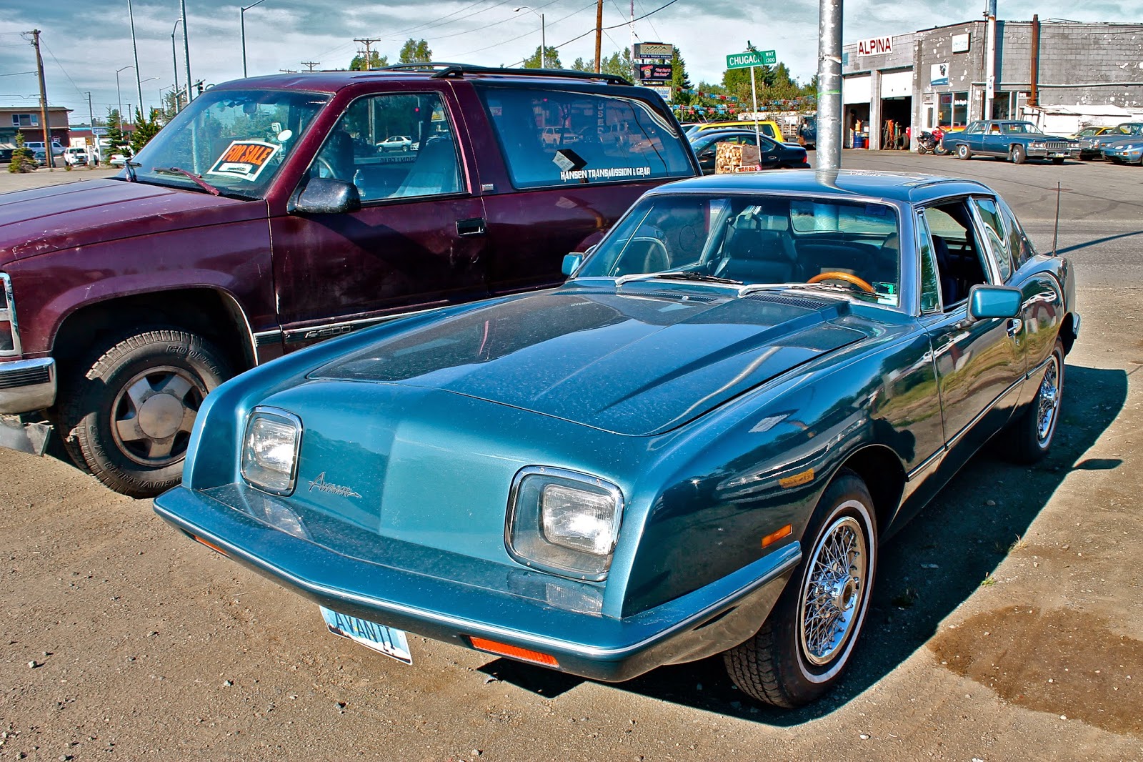
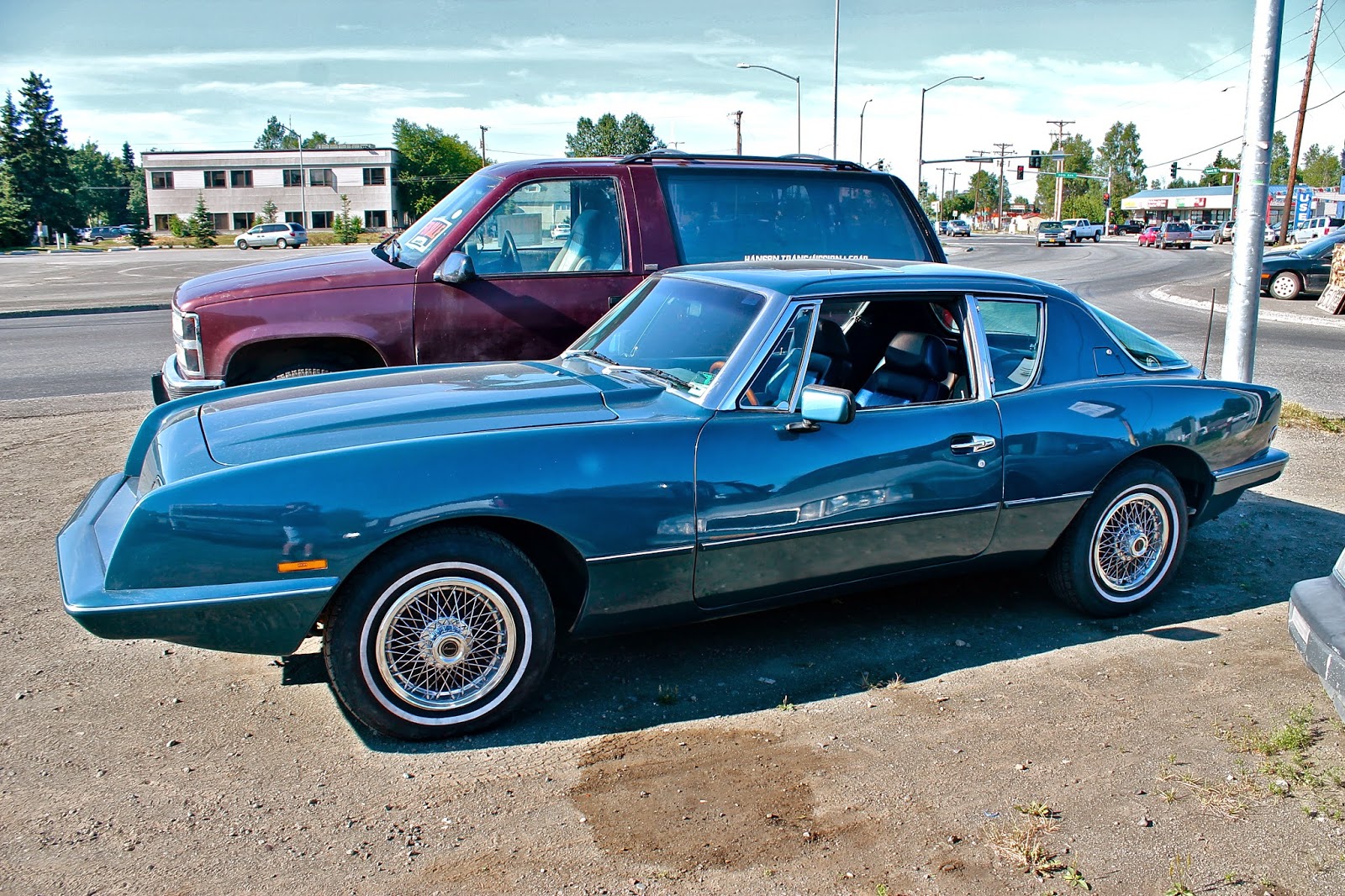
Avanti II


     When I first saw this blue Avanti shining in the Alaskan sun, I had absolutely no clue what it was, but its design really struck me, so I snapped a few photos. I then went and did some research on this intriguing vehicle, and found it had a very interesting history. Initially, the Avanti was made by Studebaker, who introduced it in 1962. But the factory in South Bend, Indiana where they were produced was shut down in 1963, ending the Avanti's time as a Studebaker, which closed down for good just a few years later. But three Studebaker dealers, Nate and Arnold Altman and Leo Newman, bought up the Avanti name, tooling, and plant space. Just a few years later, the Altman brothers introduced the Avanti II, a slightly modified version of the original. They produced the Avanti II until 1982, and the model I saw is most likely from this era. After that the car bounced around from owner to owner, until 2006 when the final Avanti rolled off the line.
     But enough history, lets get to the design. The front end looks somewhat awkward to me, as it seems to be a strange mix of sharp and smooth lines. The headlights are rectangular, and are set back a few inches, with the base and sides of this portion making sharp, almost ninety degree angles with the forward fins. I think it is a little strange for the fins to stick out that much in front of the headlight section, but it is even stranger when those fins stretch back into very smooth and curvy lines. The Studebaker Avanti, with its circular headlamps, looks more natural with the swooping bodywork. Another thing that looks strange at first is the lack of a grille, but over time I have come to like this uniqueness and it makes the car look sleeker. The hood features a bulge only on the driver's side, and gives off a powerful impression.
    The car's cabin is supported by very thin A and B pillars, but a thick upside down V-shaped C pillar. The side windows sweep upwards right in front of the aggressive rear haunches, creating a elegant curved parallelogram out of the three piece window. The continuous silver trim piece running around the car makes the car look like its almost two separate pieces, and this makes the swooping upper half appear to have a strong and stable foundation in the hard edges of the bottom section
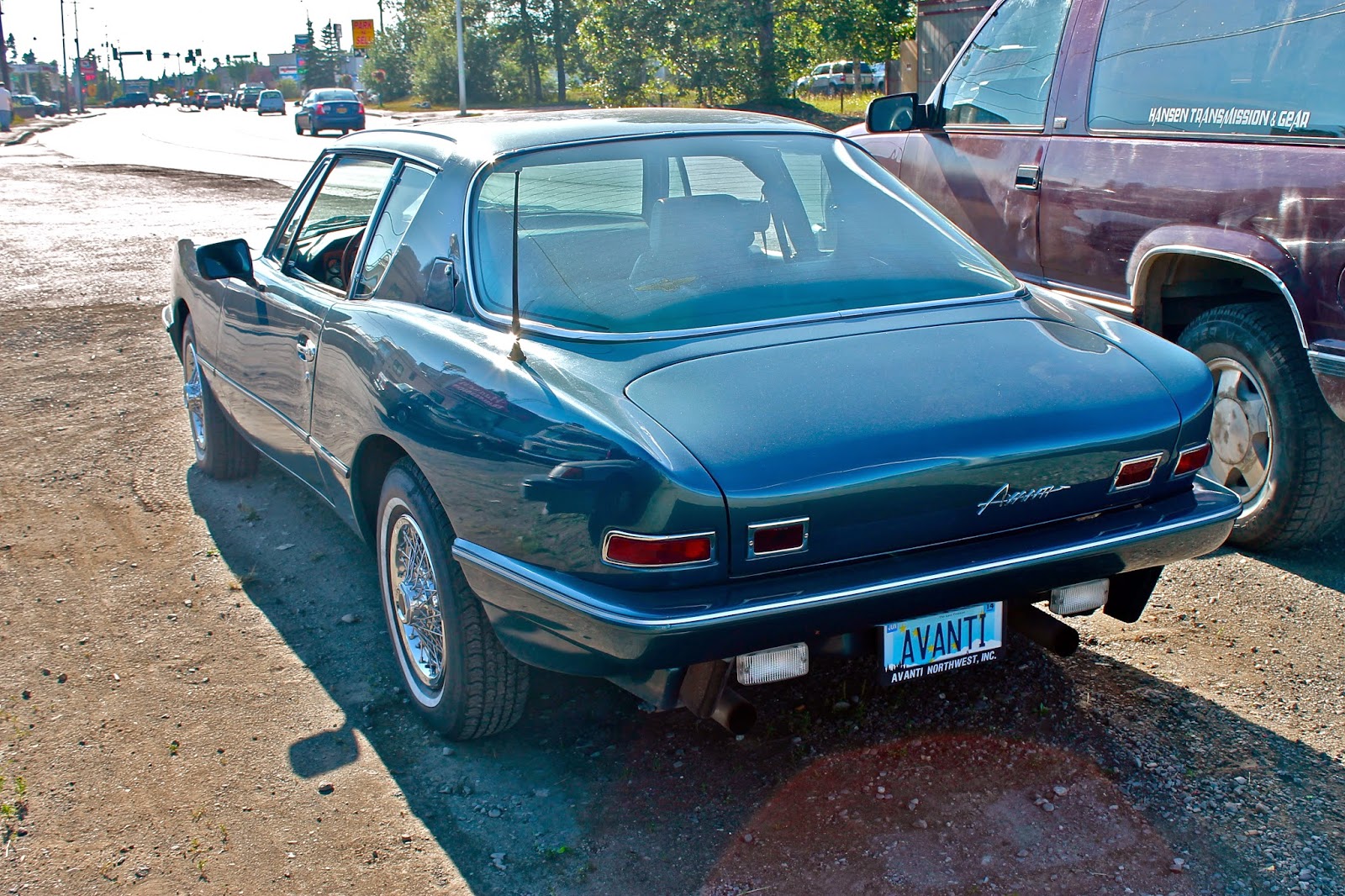
    The cockpit is finished off with an expansive, curved rear window, which runs in to the short rear deck. While the rear fenders and trunk feature very graceful lines, again the problems I had with the contrasting design from the front appears in the taillights. Each taillight consists of two separate rectangular pieces, which are honestly very boring and also don't fit with the fluid lines running down the side of the Avanti. But, while the taillights may be dull, the simplicity of the rear is quite beautiful.
     The font used on the front and rear of the vehicle makes the letters look futuristic while also appearing to be very animated and cartoon-like. And the horizontal line that runs through the whole word also makes the word seem to be in motion.
      I'm glad I stumbled upon this interesting car, and it was great to learn its history and see such an interesting, though awkward design.

Grade
Front: C+
Rear: B+
Overall: B

Sunday, April 13, 2014

Renault Twizy (Technic Trim)

       For months I had marveled over the Renault Twizy in Top Gear, hoping that someday I would get to see this quirky French design in person. So when, on my recent trip to Spain, I saw a Twizy on the street, I was just as excited as I would be seeing a Lamborghini Gallardo or Ferrari 458.
      The Twizy lived up to the hype. It is a very skinny vehicle at about 4 feet wide, and in Europe it is legally classified, not as a car, but as a heavy quadricycle. The "car" seats two people surprisingly, if the second person is willing to squish in in a tandem position behind the driver. Oh, and those doors--they're optional (and cost extra). The driver and passenger sit in a sort of cage that is perched on top of a small base which is fitted onto the chassis and wheels. The bare wheel axles protrude from the plastic base piece, and lead to tiny 13 inch alloy wheels, which sport a clean looking three triangle design. The black base features an indented  Z.E. logo (which is Renault for electric vehicle) and two small orange turning indicators. Normally I dislike large pieces of plastic on cars (for example, the Honda Element), but it doesn't look too ugly on the Twizy. Onto the main body of the Twizy, the capsule has two circular headlights sandwiching a shiny blue Renault logo, all of which is set back about half an inch in to the body of the car. The vehicle features a contrasting white bit that runs around the side windows and the doors, almost coming full circle, and this reminds me of the design of the Smart Fortwo, which features a similar piece. The doors have a relatively skinny black glass and plastic rectangular piece just below the side windows (which are made of plastic), which holds the sideview mirrors. Below this is a large black piece that finishes off the rest of the door.
      Around back the Renault has a long, singular rounded taillight, that is placed in its own little indented area, and this creates a simplistic yet futuristic look. The rear of the Twizy is considerably skinnier than the front, and this gives the car a more streamlined look, and helps with aerodynamics and therefore boosts efficiency. The base, like the front, has two small orange turning indicators, but also features two more lights, possibly brake indicators, in little pockets on either side of the license plate.
     The Twizy is the perfect mix of quirky and simple design.


Grade
Front: A-
Back: A
Overall: A