 |
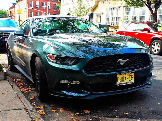
| Mustang on 16th St. in Brooklyn |
 |
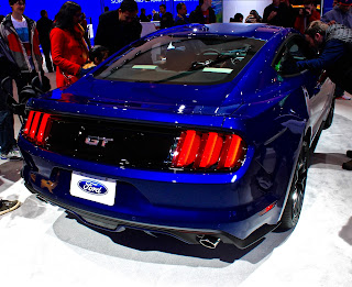
| Mustang at NYIAS |
 The front end is fairly aggressive and pretty good looking in parts, but Ford's designers could have created a faster, more agile looking muscle car. Sure, the grille keeps it's
iconic trapezoidal shape, and gets added detail with the addition of the
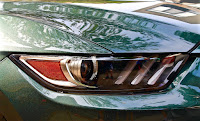
two grey bars running down either side. However, the headlights look as if they were taken straight off the Fusion midsize sedan. The Fusion is a very handsome car, no doubt, but the headlights should not be shared with a muscle car, and borrowing from the Fusion seems lazy on the part of the designers. Additionally, the headlights are set farther back and farther away from the grille compared to the previous iteration. This new location makes the 2015's grille appear snout-like, which is not a desired look in a fast pony car like this.
The front end is fairly aggressive and pretty good looking in parts, but Ford's designers could have created a faster, more agile looking muscle car. Sure, the grille keeps it's
iconic trapezoidal shape, and gets added detail with the addition of the
two grey bars running down either side. However, the headlights look as if they were taken straight off the Fusion midsize sedan. The Fusion is a very handsome car, no doubt, but the headlights should not be shared with a muscle car, and borrowing from the Fusion seems lazy on the part of the designers. Additionally, the headlights are set farther back and farther away from the grille compared to the previous iteration. This new location makes the 2015's grille appear snout-like, which is not a desired look in a fast pony car like this.Another area that could use redesigning is the lower front fascia, as the fog lamp housings are pretty simple and boring, and would have benefited from more dynamic air intakes.
 |
| Mustang at NYIAS |
Around back the Mustang looks superb. The iconic three vertical taillight housings remain, but look more modern and polished than the previous generation's. The taillights are connected by a long black rectangular panel, which looks beautiful, and gives the car a sporty vibe (similar to the effect given by Dodge's "Racetrack" inspired full-width lights). The placement of the license plate, under the taillight strip, give the rear a cleaner, smoother look.
 Overall the new Mustang is a very good looking pony car, with aggressive lines and a beautiful back end. The main reason it remains behind the Camaro in my mental list of muscle cars is because of headlights borrowed from the Fusion, and a plain lower front fascia.
Grade
Front:B
Back:A
Overall: B+
No comments:
Post a Comment