Monday, December 23, 2013

2015 Ford Mustang

Mustang on 16th St. in Brooklyn
       I consider myself a Camaro guy, but I was really hoping that the new 'Stang would sway me towards the Ford, especially given all the hype surrounding its release for the Mustang's 50th anniversary. It is indeed a handsome car, yet it remains runner-up to the Chevy, mainly because of the car's lackluster front end.
Mustang at NYIAS
      The front end is fairly aggressive and pretty good looking in parts, but Ford's designers could have created a faster, more agile looking muscle car. Sure, the grille keeps it's iconic trapezoidal shape, and gets added detail with the addition of the two grey bars running down either side. However, the headlights look as if they were taken straight off the Fusion midsize sedan. The Fusion is a very handsome car, no doubt,  but the headlights should not be shared with a muscle car, and borrowing from the Fusion seems lazy on the part of the designers. Additionally, the headlights are set farther back and farther away from the grille compared to the previous iteration. This new location makes the 2015's grille appear snout-like, which is not a desired look in a fast pony car like this.
        Another area that could use redesigning is the lower front fascia, as the fog lamp housings are pretty simple and boring, and would have benefited from more dynamic air intakes.
Mustang at NYIAS
     The Ford features two powerful creases running down the hood, and these are flanked by small hood vents. These intakes give the car a stronger more aggressive appearance, but putting the vents at the front of the bonnet, an unusual place, makes them look a little awkward. One of the strong points in the 2015 Mustang's design, running alongside the vents are sharp character lines that stretch from the recognizable grille to the windshield, where they meet up with another pair of lines that go from the headlights to the rear of the car. This car-length line creates brawny rear haunches, making the 'Stang look as if it's surging forward. The Mustang features many parallel creases, including the ones on the hood, two on each side between the wheel wells, and even two on the roof, and these add to the Mustang's muscular look.
     Around back the Mustang looks superb. The iconic three vertical taillight housings remain, but look more modern and polished than the previous generation's. The taillights are connected by a long black rectangular panel, which looks beautiful, and gives the car a sporty vibe (similar to the effect given by Dodge's "Racetrack" inspired full-width lights). The placement of the license plate, under the taillight strip, give the rear a cleaner, smoother look.
     Overall the new Mustang is a very good looking pony car, with aggressive lines and a beautiful back end. The main reason it remains behind the Camaro in my mental list of muscle cars is because of headlights borrowed from the Fusion, and a plain lower front fascia.


Grade
Front:B
Back:A
Overall: B+


Tuesday, November 5, 2013

Chevy Impala LT

Impala on 8th Ave. in Brooklyn
      When my mom rented a Chevy Impala I was both excited and dismayed. I was dismayed because in my opinion, it is a horribly designed vehicle, but I was excited because I had never been in one, and I couldn't wait to get to experience its terribleness. Here's my review on one of the most bland and boring vehicles of the last decade.
       The Impala competes against the division of full-size cars that include the Ford Taurus, Hyundai Azera, Kia Cadenza, Toyota Avalon, and Nissan Maxima. All of these cars, while not opulent, are more luxurious and offer more upscale features than the other cars made by their respective companies. The Impala though, does not look fancy inside or outside, and doesn't seem more advanced then the other Chevys.
        Let's begin with the front fascia. The two piece plastic grill is uninspiring, and the closest thing it has to being luxurious is the small chrome trim outlining it. The fat headlights are composed of three circular compartments, which use the basic reflector optics technology instead of a more advanced and better projector lamps. The lower front fascia features uninteresting air intakes, split down the middle by a thin chrome strip. The hood and side panels have absolutely no creases or other interesting bodywork. The hubcaps are a basic five-spoke design, painted in a dull silver. Moving around back, we find basic triangular taillights and that's about it. The license plate is housed in the bumper, which I believe was an immensely bad decision by GM's designers. A better place to put the plate would have been underneath a chrome bar that would stretch from taillight to taillight and have either Chevrolet or Impala etched into it. The one halfway decent thing about the exterior of the car is the spoiler, but even this element has a problem, as it feels out of place because the rest of the car is not sporty.
Impala on 8th Ave. in Brooklyn
         The interior is no better. Since the Impala we rented was a LT (the second most expensive trim), I was expecting a somewhat nice interior, but alas, my dreams were squandered by the drab dash, doors, and seats that awaited me. The black dashboard was trimmed with cheap looking fake wood. On the center console there were an abnormally small amount of controls, making it look empty, as if the designers forgot something. The gear shifter, while one of the better looking interior parts, had a major design flaw-- there were no labels. This made it a bit more confusing while driving. The gauge cluster was unimaginative, just three simple gauges on an flat black surface. The steering wheel in front of it was equally lackluster. The entire wheel was clad in a cheap black plastic-like surface, and sculpted in a fat, inelegant shape. The inside door panels of the Impala LT, were also almost entirely black, with small, shallow compartments sticking out about halfway down. There was one major design element that confused me about the door. Since the faux wood trim was continued around the corner up to the door handle indent, why wasn't more included either along the top of the door or around the rectangular compartments. While the majority of the Chevy's interior looked as if the designers had thought it up while asleep, there was one hint that they were aware it was supposed to be a premium sedan. In the wood trim on the right side of the dash was a small silver Impala logo, with skinny chrome lines extending from it on either side. While this attempt at luxury actually works, it is not enough to set off the rest of the dreary car.


Grade
Front: F
Back: F
Overall: F 


Friday, September 13, 2013

2013 US Open


I was sitting in the front seat of a 2014 Mercedes-Benz CLA45 AMG, pushing buttons and stroking leather armrests when I felt a raindrop fall through the open sunroof. As the rain began pouring down, the Mercedes-Benz representative closed up the skylight and the stand. But the hours during the rain delay allowed me to explore some of the interiors of the other cars on display at the 2013 US Open.

2014 Mercedes-Benz E63 AMG
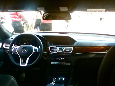
      Stepping into the E63 felt like I was stepping into a work of art. The cabin was almost completely covered in Black Nappa leather, which felt extremely soft and of the highest quality. Sitting inside it, wrapped up in the smooth seats, I felt very disconnected from the world outside the car, as if I were in a cocoon of luxury. The sophisticated interior was accented with chrome pieces and Burl Walnut Wood.
      The center console was adequate, but it was finished in a piano black surface, which may look fancy but smudges easily. Worse, the analog clock sandwiched in between the air conditioner vents was cheap and flimsy looking.  One detail that I particularly enjoyed was the AMG seal stamped onto the gearshift. I also had fun playing with the center compartment, which had two doors that swung open at the push of a button. It was overall a very luxurious and beautiful interior, and my only real issue was a cheap clock.


2014 Mercedes-Benz CLA45 AMG
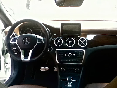
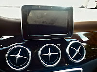
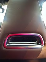
     After bathing in the expensive leathers of the approximately $90,000 E63, the $56, 000 CLA45 felt considerably less luxurious. There were more plastics throughout the cabin, and the leather surfaces weren't as upscale feeling. The very pretty dashboard looked like it had been blown into its current shape, except I thought the placement of the screen, sticking up on top, was weird because it couldn't be folded down when not in use, which took away from the aerodynamic appeal of the dash. One detail that I really thought was a nice touch were the air conditioning vents, three of them, right below the screen in the center console. The four separators reminded me of airplane propellers, and I'm a big fan of airplane design elements appearing in cars. I also loved the rectangular hole that separates the headrest from the front seat, because I felt like it kept the theme of flowing air that is emphasized in the dash. In the backseat, the cup holders sprung out of the fold down center area with the push of a button. While it wasn't as nice as the more expensive E63, I thought it was overall a very beautiful design and a good interior for the money.


2013 Smart Fortwo Brabus Tailored
    Since Samrt is owned by DaimlerAG, who also owns Mercedes-Benz, therefore a Smart stand is present at the US Open, showing off the not-so-new Smart Fortwo. The first Smart car I sat in was the Smart Fortwo Brabus Tailored, which is designed in collaboration with Brabus, an aftermarket tuning company. This was probably the best-looking Smart interior I've ever been in, and the light brown pleated leather looked very nice. There were, however, a few issues I had. The first and foremost was how disproportionate the leather was placed throughout the cabin. The seats and doors are swathed in the stuff, while there is practically none on the dashboard. Also the cheap black plastic on the dash didn't contrast well with the rest of the car, making it seem as if the designers were too lazy to think of a unique dashboard. Also, I felt that while the interior was very unique, the exterior looked pretty much like every other Smart Fortwo,  which took away from the special feel of the car. Another small quip I had was the storage flap on the bottom of the door (it is mostly blocked by the seat in the photo), which felt very cheap and flimsy and incapable of holding much. While the Smart Fortwo Brabus Tailored's interior is unique, an unfinished dashboard and a boring exterior make it feel cheaper and more ordinary.


2013 Smart Fortwo Electric Drive
     The final car I sampled was the Fortwo Electric Drive, an EV version of the well-known Smart car. On the exterior, the vibrant green paint nicely contrasted the white body paint, but when I stepped inside, I immediately noticed something horribly wrong. While Smart did a nice job using green, commonly associated with EVs, on the outside, the designers had seemed to have forgotten about  the interior. Except around the gauges, green was absent from the cabin; the black interior instead being contrasted with an ugly, cheap, and boring silver plastic. If the bright green had been put on the steering wheel
 , door handles, around the radio, and instead of all the silver bits, it would have enhanced the Electric Drive's interior greatly. If this had been done, I would have really enjoyed the Smart Fortwo Electric Drive, and might have spent more than three minutes in it. (Side note: While not a bad thing, the gauges reminded me of those on the Mini Cooper Hardtop).


Saturday, August 24, 2013

2014 Cadillac CTS


CTS at NYIAS
  When I heard that the new Cadillac CTS would be shown at the 2013 New York International Auto Show I was very excited. But also a little scared. In the days preceding my visit to the show, I prayed that the Cadillac designers hadn't messed up one of my favorites-- I have three posters of the second generation CTS on my wall.
    Unfortunately, when I finally reached the Cadillac stand, I was disappointed.
     Its not that the new CTS is an ugly car. In fact it is quite stylish. But the previous incarnation had a unique--almost boxy, with hard edges yet still remarkably sleek--look, while the new version, with the angles toned down, lacks that powerful and luxurious vibe.
CTS at NYIAS
     The new CTS does take some strides forward. The headlights  retain the original vertical shape but they are more detailed, keeping in line with the Cadillac design language shown in the headlights of the XTS and ATS. I also love how the running light, while separate still follows the line made by the LED strip in the headlight. Another area where Cadillac succeeds was in the character lines, which remain strong and muscular. I particularly like the way the crease that stretches from the front side vents to the taillights separated the headlights from the grille, giving the hood its own distinctive shape.

CTS at NYIAS
Now let's focus on what went wrong. Starting at the front, the grille and other front vents have had the edges smoothed out, and have lost the subtle jagged look that made me fall in love with the previous CTS. Another huge problem is in the rear: the taillights are too smooth and remind me to much of the XTS's taillights, which led me to think the designer had become lazy and just cut and pasted the XTS taillights on.
Another thing that has gone awry is the brake light. On the previous generation, the V-shaped brake light acted as a spoiler while fitting in with the angular design of the car. Now the brake light has lost most of the V and is a lot less radical looking.
The previous generation Cadillac CTS coupe
      If somebody offered me a Cadillac CTS I'd still accept it, but I hope that Cadillac is able to find its way again in the next update to the CTS.


Grade
Front:A-
Back: C+
Overall: B+
 

Monday, August 12, 2013

Subaru WRX Concept


WRX at NYIAS
      When I reached the Subaru section, I ran past the boring family cars for which they're known, the Outbacks and Foresters. I even skipped the sportier BRZ to get a look at the WRX concept. This car exudes excitement, from the aggressive headlights to the glowing exhaust tips. The headlight shape is very unorthodox, as an "eyebrow" extends beyond the bulb itself towards the grille, where it features "eyelashes" dropping down below the inner section of the "eyebrow." I particularly like the way Subaru experimented spatially, as the main rectangular bulb is set back deep in the car, and is outlined by emerging rectangular halos. 
WRX at NYIAS
       The hexagonal grille juts out in front of the angular headlights, and has a light-up neon green "WRX" badge on the lower right corner. The concept's lower front fascia is dominated by large attractive air vents, which lends to the sedan's sporty vibe. Below the headlights are equally futuristic fog lamps, which have backwards L-shape pieces accented by three vertical lights, which enhances the glowing effect of the front fascia. 
      The body features many strong character lines, which reinforce the vehicle's athletic nature. On the hood, the air intake is flanked by to converging creases, and a deep "canyon" extends from the intake to the front of the car. A sharp line goes from the headlights over the wheel arch and into the vent behind the wheel, where it then sweeps back to the taillights, create the sedan's coupe-like profile. This crease makes the car feel as if it is traveling through the air extremely fast, giving the sense of motion even when it's at rest, which unfortunately it will be forever, as it is purely a design study. 
WRX at NYIAS

WRX at NYIAS
       The vent, which sits behind the large silver twin-five-spoke wheels (accented by highlighter green brake discs) is a basic but necessary opening that allows for cooling for the brakes. Around back are the WRX's backwards C-shaped taillights, which protrude from the much narrower upper rear end. The taillights stand out because of the differently shaped crystals inside, which glowed and reminded me of lava. Beneath them are the exhaust tips, which have one last unique detail--a ring of bright green light around the edge.
      Hopefully Subaru will take as many of these awesome details into production as they can when the next-generation WRX model comes out in the next couple of years.

Grade
Front: A
Back: A
Overall: A

The following few posts are from the New York International Auto Show this past April at the Javits Center in Manhattan.

Wednesday, June 26, 2013

Chevrolet Cruze LT


Cruze in Naples, Florida
       On my recent vacation to Florida, my family rented a Chevrolet Cruze LT. This handsome sedan, introduced in 2008, is built on the Delta II platform, which it shares with the Buick Verano, and has an inline-4 under the hood, capable of going 0-60 in 9.2 seconds. Our Cruze was fitted with the RS package, which adds unique front and rear fascias, lower body moldings, and a rear lip spoiler.

          The Cruze's front fascia features angular headlights, which have an elongated look, as the upper left corner is stretched back over the front of the wheel arch, forming a crisp line that flows into the window lining. This make the sedan look aggressive, giving it a sports car feel. The Cruze also features the corporate Chevy two-piece grille. Although its not particularly revolting, I dislike the bar running through the middle of the grill, because it makes the grill feel smaller. The idea of a small grill reminds me of the ugly cars of the 90's and early 2000's, which had useless, miniscule grilles (i.e. Ford Contour). The lower front fascia has fog lamps, surrounded with chrome inserts, which give the car an upscale look. Moving back, a sharp crease runs just above the door handles, and about 6 inches below the window sills, giving the body more texture. The hubcaps, although a pretty basic 5-spoke design, reinforce the Cruze's sporty vibe. At the rear, we have one piece taillights, which have two circles, the outer one larger than the other, which is similar to the two piece taillights of the Camaro or Corvette, or the almost two-piecers of the Malibu and Traverse. A rectangular chrome bar connects the taillights, and the Chevy badge, and Cruze and LT are written above it. While this Chevy is conservatively styled, it is still a good-looking compact.                                                                          
Cruze in Naples, Florida
        Now for the interior. The center console featured silver plastics contrasted by a piano black surface. It is luxurious looking but can be annoying as it smudges and shows fingerprints easily. The infotainment screen was of a decent size, and worked fairly well, although we didn't use it that much. My only complaint was that sometimes it felt as if it was too backlit, that there was too much exposure. The majority of the buttons, dials, and switches were easy to use, and the hazard button and the AC dials were very easy to find.

The steering wheel has a somewhat clean design, with only a moderate amount of buttons and a basic layout. The instrument cluster is also very basic, although the center gauge could've been put to better use, for a larger speedometer possibly. The seats, while not the most comfortable, were nice enough for an inexpensive compact. The only place where I felt uncomfortable was the backseat. I'm fairly tall, and therefore I felt a lack of headroom (I hit my head into the roof on multiple occasions) and also the seatbelt dug into my shoulder. This made long drives pretty awkward for me, as I had to sit hunched over. Another minor quibble I had was that  the overhead light section in the front had too much empty space, which could've been use for bigger lights, or, as I have seen in cars like the Australian Toyota RAV4, a small, swing-down storage compartment.

        But despite the few minor complaints, the Cruze was overall a very good looking car, because of it's slight sporty feel, and a pretty comfortable car on the inside.

Grade
Front: B+
Back: B

Overall: B+


1957 Chevrolet Bel Air


Bel Air in Naples, Florida

    Seeing this 1957 Chevy Bel Air cruise down the street, evokes a desire to have lived then, when cars came in pastel colors, had massive fins, and were works of art. This Chevy is especially gorgeous, with bright turquoise paint and many chrome accents. The majority of the chrome is on the complex front bumper which incorporates the grille, and an older version of the Chevrolet logo. The car, like other 50's cars, has airplane inspired elements. On the grille, beneath the circular headlights, is a cone-like protrusion that looks similar to a jet engine. Also, on the front of the hood, the Bel Air features two "windsplits" which appear to be airplane-inspired as well. They have what look like vertical stabilizers (the rear fin on planes) sticking up next to the missle-like main section of the windsplit. The Chevy's modest headlights hide under the hood, and sandwich the script "Chevrolet." The car's basic taillights also hide under an overhang, but this one is the sharp tail fins. While definitely not the largest fins from the 50's, these still prove adequate in representing the trends from that decade. Along the side of the Bel Air is a shiny silver character line, which makes a downward curve at the rear of the car, outlining the gorgeous fin. A smaller crease splits off, creating the top of a section of white paint, which is shaped like a smaller version of the fin. Bel Air is elegantly written in cursive, and is placed next to a coat of arms with a Chevy logo in the center, on the back end of the fin.
Bel Air in Naples, Florida
The white wall tires also signify this auto as vintage, and the rear wheels peek out from under wheel covers.
     And while it would be inefficient and inconvenient to build such large cars now, I still wish that design this beautiful and intricate was used today.


Grade
Front: A
Back: A-
Overall: A

Maserati Quattroporte Sport GT S


Quattroporte in Naples, Florida
    As soon as I saw the Maserati logo on the grille, I brought my camera to my eye and snapped a photo. I was eager to take the photo because I associate Maserati with luxury but when I looked back over my photos, I realized that this Maser isn't a particularly interesting or good-looking car. In fact,  it's downright dull.
     The car's overall shape is very simple, just a normal 4-door sedan. That shouldn't be an issue but the QP lacks any strong character lines, making it's bodywork appear plain. The only creases are a minor hood bulge, and a weak line that stretches from the uninspiring headlights to taillights so boring they make those headlights look exciting.
      Those headlights, which feature two xenon headlamps and a strip of LEDs, are set about a half a foot farther back than the grille. This makes the Maserati signature grille stick out, but because the grille is vertically flat the nose of the car looks like a pig's snout. Another Maserati design cue, the three ports just behind the front fenders, doesn't seem to fit on the QP. The ports give off a sense of sportiness, leading me to think the designers just stuck them on because the ports are on every Maserati car.
Quattroporte in Naples, Florida
     The only things I actually like about this car are the lower fascias, which are aggressive and clean while also making it so there is no blank space on the bumpers. Another small detail that I liked was the Maserati trident on the C-pillar, just behind the rear window. While this may seem insignificant, it adds a touch of luxury and elegance to the car, and is pretty unique.
     Brand image can be fooling. While the name "Maserati" makes me think of luxury, when I examined this Quattroporte I found that it is not a particularly elegant car.


Grade
Front: C
Back: D
Overall: D 

Mercedes-Benz SLR McLaren Roadster


SLR McLaren in Naples, Florida
     Mercedes-Benz and McLaren  had grand ambitions when they collaborated on this grand tourer,  but while it sports a sleek look, those aspirations did not show through, as the SLR's design is too simple. While there is nothing terrible about the Merc, much of the design failed to make a lasting impression.
        The grille is often literally what sticks out most in a car. If this car wanted to grab our attention, it should not have had a boring, rectangular grille running on a slight downward angle into the hood bulge--a splash of chrome on the grille's bar could have livened up the front fascia. Below the grille, there's just nothing there and, again, some chrome would provided panache.
       The headlights, two joined vertical ovals featuring xenon headlamps, fit in with Mercedes' brand look from that era--this car was produced from 2003-2009--but while they fit in with the W203 C-Class, which was a more conservative car, it is a bit too basic for this luxury sports car.
        Walk around the back and it's more of the same. The lower rear fascia wears nothing more than a frowning look, with an arch curving over the reverse lights and down to the underside of the SLR. The brake light is mounted on the underside of the lip spoiler, and the designated license plate spot is simply an indent in the rear bodywork. Again, I was disappointed by the simplicity of the design of the rear fascia, expecting something more flashy, maybe a chrome bar connecting the taillights or more glamorous license plate spot.
    Don't get me wrong, there's plenty to like about the SLR McLaren. The car's long hood features a bulge that is a reminder of the might of the 617 horsepower V8 engine underneath. This bulge stretches from the windscreen down to the grille, where it comes to a point, a protrusion that holds a large Mercedes-Benz emblem and is flanked by sporty silver horizontal vents close to the windscreen. The vents are split into three pieces by silver dividers--the car's vents are my favorite touch and exactly what  this car could use more of. 
     Just behind the luxurious 10-spoke silver wheels is another sleek air vent, with a similar design to the ones on the hood, except the dividers are horizontal and the vents themselves are vertical. These vents have a retro feel, reminding me of the vents on the 300SL Gullwing. The bottom of the vent runs into a clean character line which forms the outline of the doors. Another strong character line, actually more like a small inversion, runs from in between the oval headlamps, along the body, and around the seats, making almost a full circumnavigation of the vehicle.
                               SLR McLaren in Naples, Florida
     The highlights of the rear are the complex and futuristic taillights, similarly shaped to those on the current C-Class, with the silver C-shaped housings within the taillights that contain the LEDs being my favorite detail. 
     When the SLR McLaren cruises by you may think it's a real looker, but when examined closely, we realize that the Mercedes-Benz didn't live up to its potential in design.


Grade
Front: B-
Back: B-
Overall: B-


This past spring my family traveled to Florida to visit my grandfather. The streets of Naples, where he lives, were packed with tons of interesting cars, and my first few posts will feature some of the cars I saw there.


Sometime later during the summer, I will post about the new sheetmetal I viewed at the 2013 New York International Auto Show.
I love cars. I have been fascinated by cars since I was one and a half years old, especially the visual aspect--I've always taken note of the design element, the headlights, the grills, the overall shape. When I was younger I spent hours with my Matchbox and Hot Wheels but I've also gone to the New York International Auto Show since 2009-- my parents even let my brother and me go without them the last two years so I could spend more time looking at each and every model.

Recently, my grandfather pushed me do something with this passion, and inspired me to create a blog where I can write about cars. I also love photography and take pictures of cars whenever I can. My blog, Auto Paparazzi, will focus on the aesthetics of cars, new and old, as I explore what I like and don't like about each car.