I was sitting in the front seat of a 2014 Mercedes-Benz CLA45 AMG, pushing buttons and stroking leather armrests when I felt a raindrop fall through the open sunroof. As the rain began pouring down, the Mercedes-Benz representative closed up the skylight and the stand. But the hours during the rain delay allowed me to explore some of the interiors of the other cars on display at the 2013 US Open.
2014 Mercedes-Benz E63 AMG
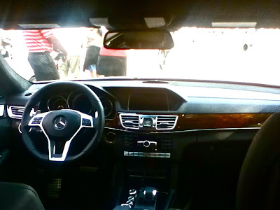 Stepping into the E63 felt like I was stepping into a work of art. The cabin was almost completely covered in Black Nappa leather, which felt extremely soft and of the highest quality. Sitting inside it, wrapped up in the smooth seats, I felt very disconnected from the world outside the car, as if I were in a cocoon of luxury. The sophisticated interior was accented with chrome pieces and Burl Walnut Wood.
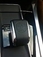 The center console was adequate, but it was finished in a piano black surface, which may look fancy but smudges easily. Worse, the analog clock sandwiched in between the air conditioner vents was cheap and flimsy looking. One detail that I particularly enjoyed was the AMG seal stamped onto the gearshift. I also had fun playing with the center compartment, which had two doors that swung open at the push of a button. It was overall a very luxurious and beautiful interior, and my only real issue was a cheap clock.
2014 Mercedes-Benz CLA45 AMG
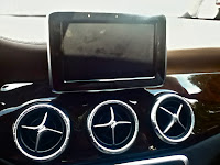
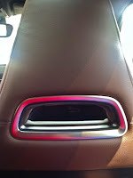
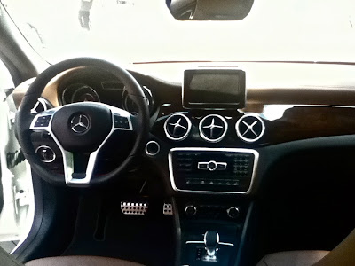 After bathing in the expensive leathers of the approximately $90,000 E63, the $56, 000 CLA45 felt considerably less luxurious. There were more plastics throughout the cabin, and the leather surfaces weren't as upscale feeling. The very pretty dashboard looked like it had been blown into its current shape, except I thought the placement of the screen, sticking up on top, was weird because it couldn't be folded down when not in use, which took away from the aerodynamic appeal of the dash. One detail that I really thought was a nice touch were the air conditioning vents, three of them, right below the screen in the center console. The four separators reminded me of airplane propellers, and I'm a big fan of airplane design elements appearing in cars. I also loved the rectangular hole that separates the headrest from the front seat, because I felt like it kept the theme of flowing air that is emphasized in the dash. In the backseat, the cup holders sprung out of the fold down center area with the push of a button. While it wasn't as nice as the more expensive E63, I thought it was overall a very beautiful design and a good interior for the money.
2013 Smart Fortwo Brabus Tailored
Since Samrt is owned by DaimlerAG, who also owns Mercedes-Benz, therefore a Smart stand is present at the US Open, showing off the not-so-new Smart Fortwo. The first Smart car I sat in was the Smart Fortwo Brabus Tailored, which is designed in collaboration with Brabus, an aftermarket tuning company. This was probably the best-looking Smart interior I've ever been in, and the light brown pleated leather looked very nice. There were, however, a few issues I had. The first and foremost was how disproportionate the leather was placed throughout the cabin. The seats and doors are swathed in the stuff, while there is practically none on the dashboard. Also the cheap black plastic on the dash didn't contrast well with the rest of the car, making it seem as if the designers were too lazy to think of a unique dashboard. Also, I felt that while the interior was very unique, the exterior looked pretty much like every other Smart Fortwo, which took away from the special feel of the car. Another small quip I had was the storage flap on the bottom of the door (it is mostly blocked by the seat in the photo), which felt very cheap and flimsy and incapable of holding much. While the Smart Fortwo Brabus Tailored's interior is unique, an unfinished dashboard and a boring exterior make it feel cheaper and more ordinary.
2013 Smart Fortwo Electric Drive
The final car I sampled was the Fortwo Electric Drive, an EV version of the well-known Smart car. On the exterior, the vibrant green paint nicely contrasted the white body paint, but when I stepped inside, I immediately noticed something horribly wrong. While Smart did a nice job using green, commonly associated with EVs, on the outside, the designers had seemed to have forgotten about the interior. Except around the gauges, green was absent from the cabin; the black interior instead being contrasted with an ugly, cheap, and boring silver plastic. If the bright green had been put on the steering wheel
, door handles, around the radio, and instead of all the silver bits, it would have enhanced the Electric Drive's interior greatly. If this had been done, I would have really enjoyed the Smart Fortwo Electric Drive, and might have spent more than three minutes in it. (Side note: While not a bad thing, the gauges reminded me of those on the Mini Cooper Hardtop).
No comments:
Post a Comment